Bayer Cardiovascular Franchise Visual Identity
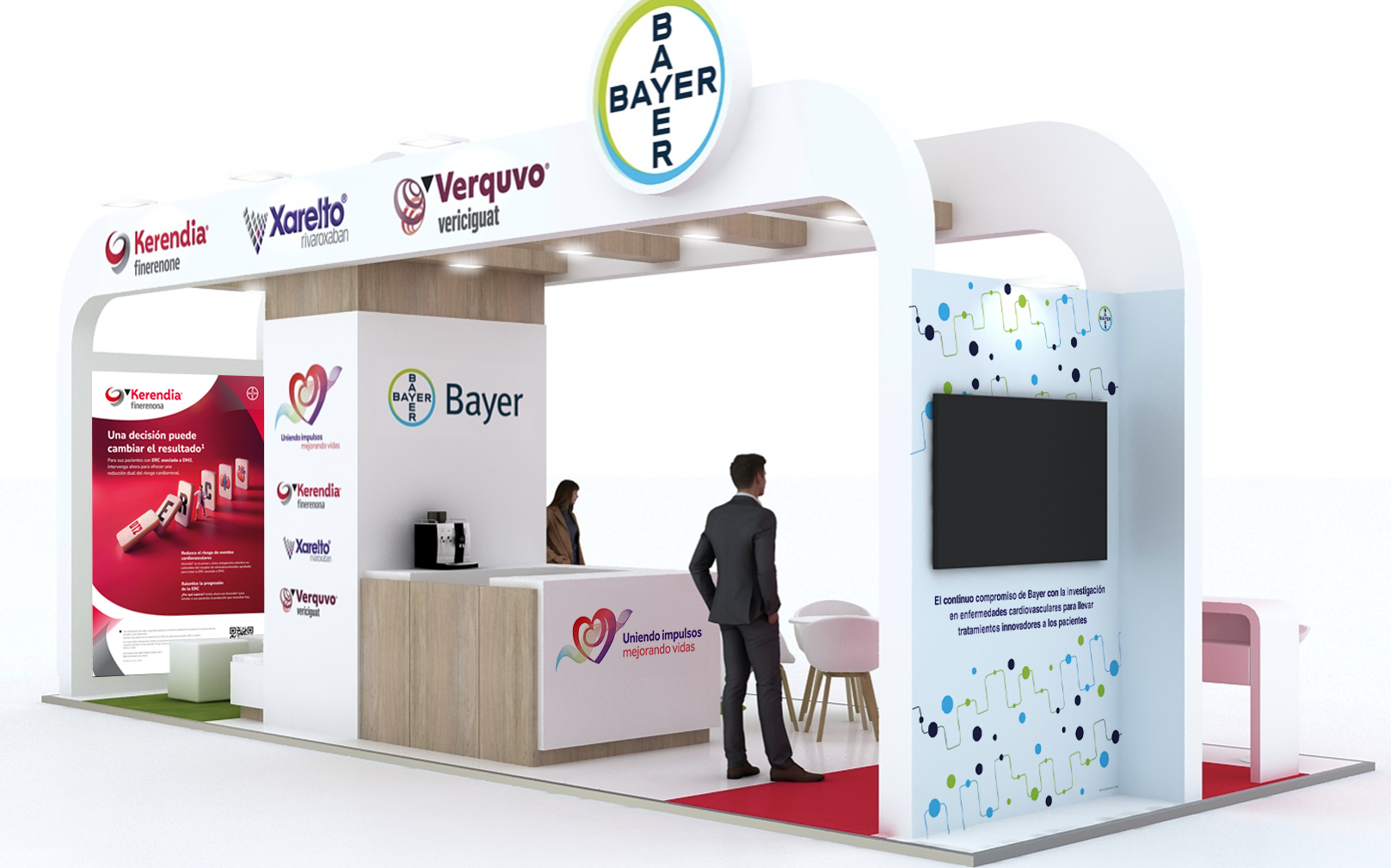
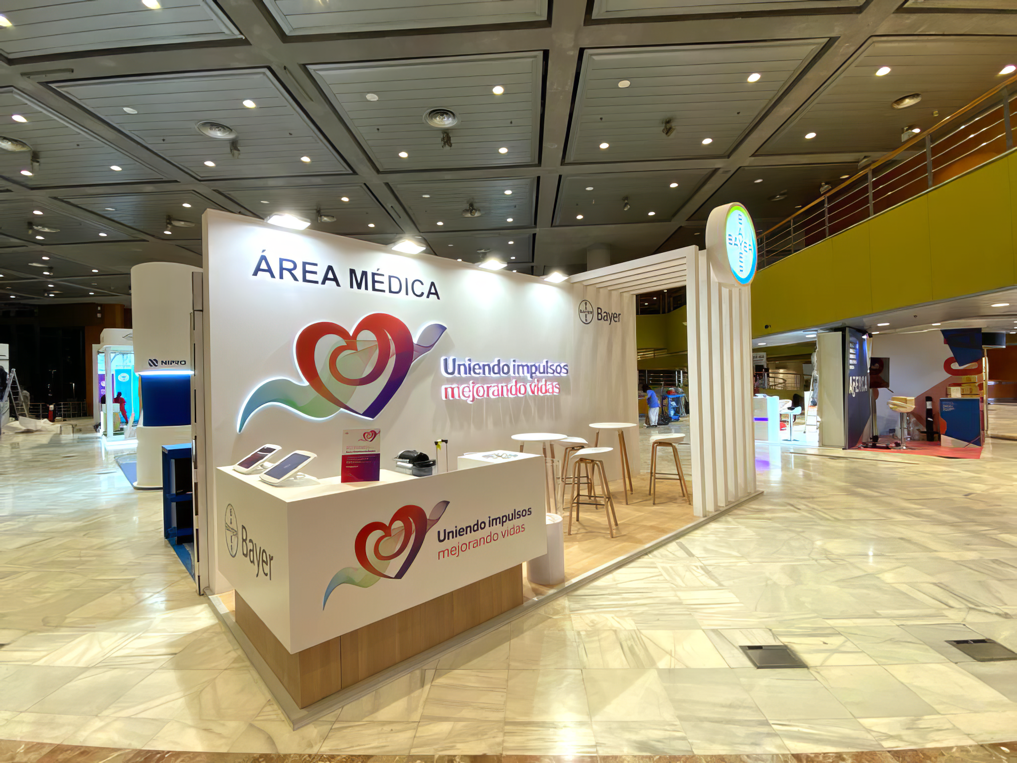
At HOW, we developed the visual identity system for Bayer Spain’s cardiovascular and cardiorenal franchise, bringing together Kerendia®, Xarelto® and Verquvo® under one clear and consistent brand language.
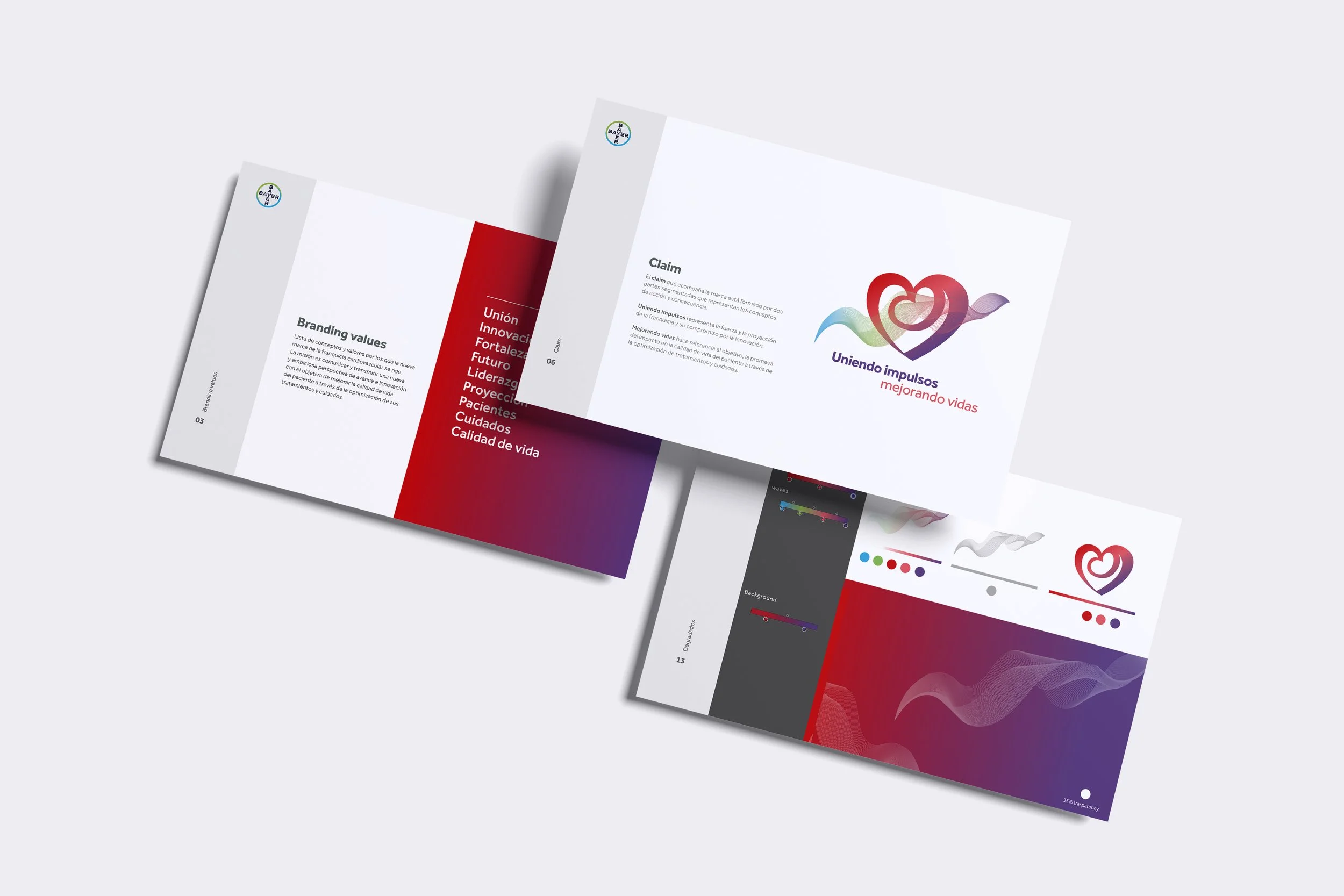
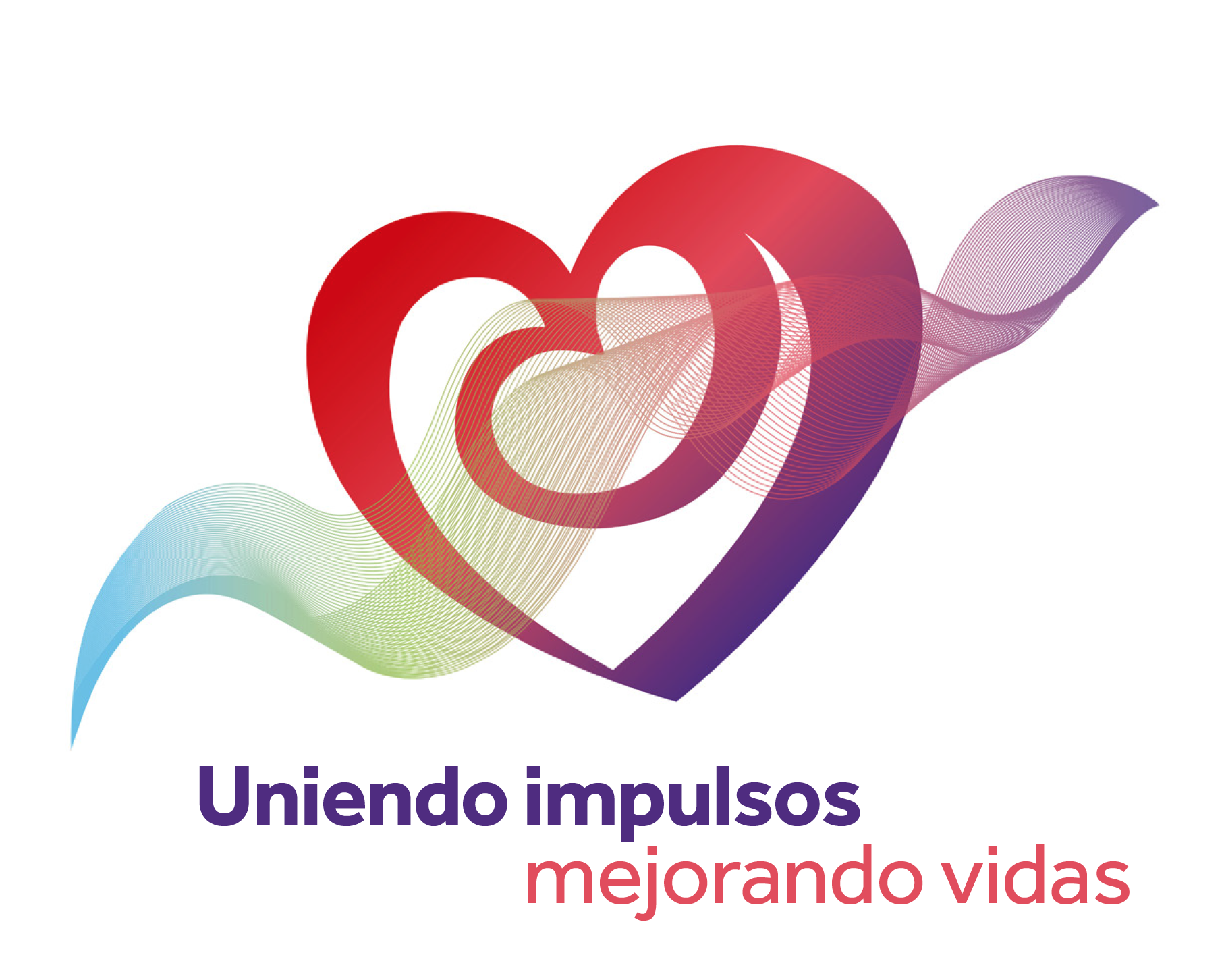
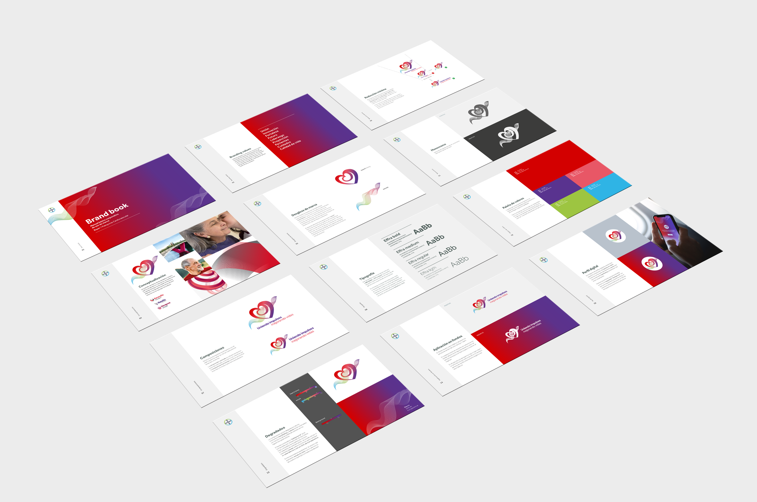
The concept was built around a custom symbol inspired by the fusion of a heart and a kidney, reflecting the connection between cardiovascular and renal care. From there, we created a flexible identity system that combined product-inspired colours, Bayer’s corporate universe and a graphic language designed to express innovation, care and quality of life.
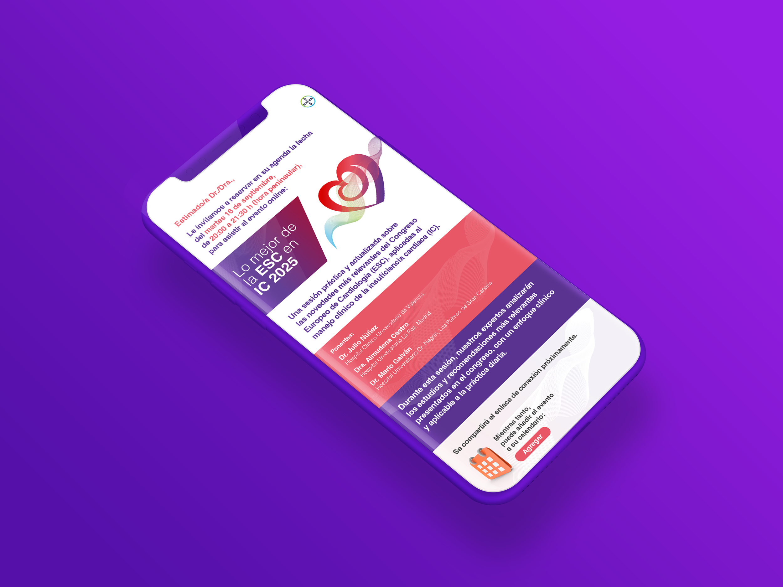
Beyond the logo, the project extended across multiple online and offline communication materials, including brand guidelines, event brochures, congress materials, stands, spatial graphics, newsletters, presentations and digital assets. The result was a cohesive visual system designed to bring consistency, recognition and clarity across every touchpoint.
A strategic identity created to unify a complex therapeutic franchise through one strong visual narrative.